Refreshing the ATC Preparation Logo

The ATC Preparation logo has been refreshed. It is still the same control tower. The colours are more modern, the drawing is cleaner, and the mark is easier to use across our marketing.
Last updated: September 25, 2026

From the start of the company
The previous logo had been with ATC Preparation since the company began. It carried the firm through the first years of the site and the training. That history is worth keeping. The time had come for an upgrade: the same tower, brought up to a standard we can stand behind now.
Colour and line
The refresh stays with the tower candidates already associate with ATC Preparation. The palette has been brought forward, and the linework has been simplified, so the mark reads with less visual noise. On the site, in a presentation, or in a social graphic, the result is the same identity, rendered with more care.
A mark built for marketing
A logo has to travel. Campaign banners, thumbnails, documents, and social posts all ask for the same symbol at different sizes and crops. This version is cleaner to place, and it stays consistent wherever it is used. That is the practical gain of the refresh, and the reason it was worth doing.
On the site
The header now carries the refreshed logo, and the same artwork is used when a page from ATC Preparation is shared.
Related Blog Posts
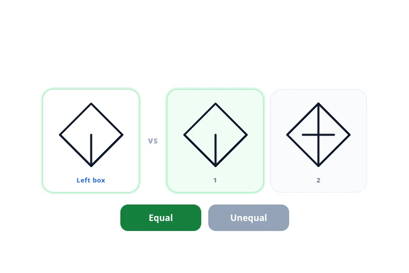
New FEAST Module: Scan And Compare Figures Is Now Available
Scan And Compare Figures is now in the FEAST Preparation Suite. Compare the left figure with the fig...
Read More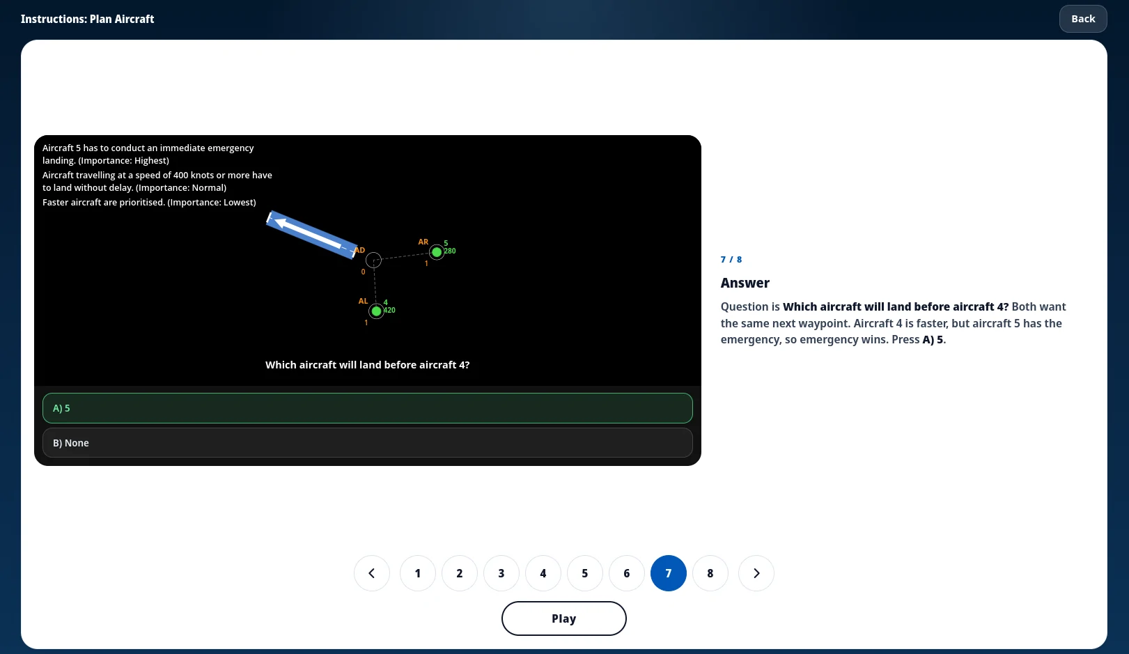
Every FEAST I Game Now Starts With Instructions
FEAST I modules now open with a short walkthrough of the board before the timed round, and the same ...
Read More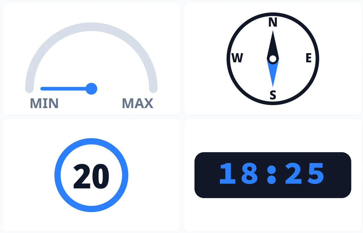
Remember Instrument Readings Is in the FEAST Preparation Suite
A new FEAST I memory task: a mixed instrument panel is on screen for a few seconds, then you recall ...
Read More